


I previously wrote an article about the RS Line: RS Line vs RS Rating – What’s the Difference? I explained the basics of the RS Line and the information it represents. What I didn’t cover are examples showing how to best put the RS Line to use - that’s where this post comes in.
As a quick review, the RS Line plots the performance of a stock versus the S&P 500. For example, if the S&P 500 is declining, and at the same time a stock is rising, that stock’s RS Line would trend up.
RS Line Showing Strength in a Stock
One of the first things my eyes navigate towards when pulling up a chart, is the RS Line. I look for a clear indication the RS Line is trending upward. The example below speaks for itself.
A strong upward sloping RS Line is applicable for any chart time-frame: daily, weekly or monthly.
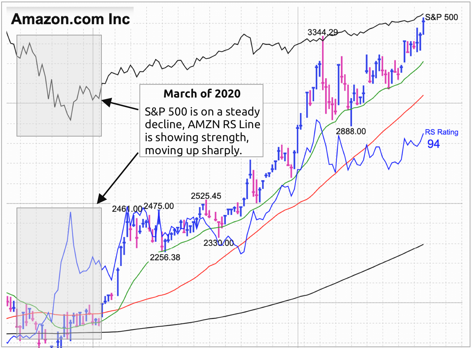
RS Line During Market Correction
During a market correction, stocks with an RS Line sloping up are often the first to move as the market turns the corner. In addition, these same stocks often become early leaders in the next upward trend.
Amazon (AMZN) is a good example. Notice the RS Line was moving up in a nearly vertical manner during the March, 2020 correction. Amazon continues to be leader, five month later.
Using the RS Line to Find Long-Term Leaders
A good way to find long-term leaders is to look at a monthly chart and focus on the RS Line. It should be steady and trending up over a long period. Microsoft (MSFT) is a classic long-term leader. It has consistent sales and earnings growth and minimal volatility.
More Information on RS Line
- How To Invest In Growth Stocks: Use The Relative Strength Line Correctly
- When To Sell Growth Stocks: Why The Relative Strength Line Can Flash Weakening Health